The Western Cape, like much of South Africa, has had its symbolic representation redesigned to fit new political constituencies. But did they need to be this bad?


I have no memory of the coat of arms for my local municipality, but having returned to my hometown a few years ago, I was confronted with the ubiquity of what looked like the ugly stepchild of the Fair Trade logo, and at first suspected it belonged to some local recycling company.

In fact, no. It was the logo which represented the local government. Apparently the weird little homunculus doing gymnastics in the middle is supposed to be Nelson Mandela. The previous logo, it turns out, was even uglier:

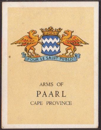
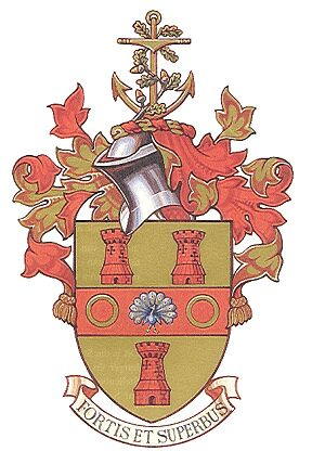
This is an extraordinary downgrade from the coat of arms borne by the main town, Paarl. The Paarl coat of arms bears a striking resemblance to the coat of arms for Oudtshoorn, which is no coincidence, since it was taken from the arms of Baron Van Rheede van Oudtshoorn, Lord of Drakenstein. That would, to a reasonable and heritage-minded person, suggest that the municipal logo should have in some way resembled it, but unfortunately, some useless prick with a clip art library had a go at it instead.
Strangely enough, the powers that be chose to remove the historical name of the broader district too - we used to be referred to as the Boland, remembered in poetry and songs for centuries, and now we are just “the winelands”. I find myself erroneously using this strange toponym myself these days.
Of course, “Boland” as an official name for the district only lasted for four years before being erased, for reasons unknown.

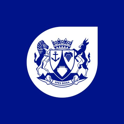
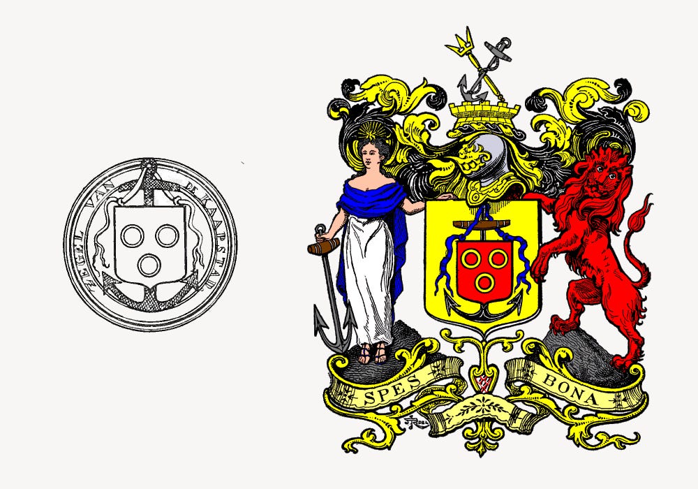
Cape Town is of course a rather sad story. Unlike Drakenstein, where the old heraldry was rendered redundant with the merger of the towns that now constitute it, there was no reason for tearing out the old arms.
But of course, it was the New South Africa, so we had to have a hippy fingerpainting instead. But not to be outdone, in 2014, Patricia de Lille had the ratepayer fund some mugu to the tune of R2 million to produce the great neon sphincter we are now all familiar with.
But Cape Town is not alone - Knysna has the sort of thing one expects on the entrance to a cheap New Age spa treatment shop:

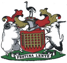
Knysna’s old arms, designed in 1959, are rather lovely, and have all manner of references to the things Knysna is known for, as well as the nature of its founding.
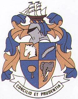
The white horse's head honours the town’s founder, George Rex, who was once falsely rumoured to be the illegitimate son of King George III, King of Great Britain and of Hanover - the white horse being a reference to the arms of the Kingdom of Hanover.
The rest represents the local natural environment, a fern leaf and the yellowwood tree, both indigenous species, and an elephant, a reminder of the herds that once roamed freely in the area, now reduced to one lonely and irritable old female.
The crest features the brig Knysna, a ship built by George Rex himself and well-known in local waters. The town’s motto, means "with co-operation and prudence," which is ironic considering the town’s present notoriety for hung councils and terrible governance.
George has decided to be stupid as well.
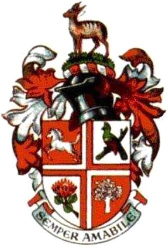
Early in the 20th century, George began using an unofficial coat of arms, but were only officially recognised in 1957, and only officially registered with the Bureau of Heraldry in 1994, not all that long before some bright spark decided to reduce them to a piece of old clip art.
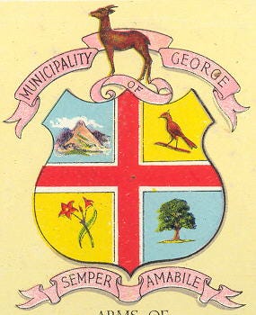
The town itself is named after King George III of the United Kingdom, so naturally has a St George’s Cross at its heart. It also contains a Knysna loerie and the red amaryllis flower, both native to the region, and an oak tree, which is a sort of staple feature of the old Cape. A little bushbuck sits on the crest.
When the arms were formally granted, the first quarter was updated, likely drawing from the Hanoverian coat of arms, a part of the British royal arms until 1837. The amaryllis were replaced with a protea.
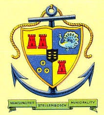
Stellenbosch stands out as having perhaps the only modern logo that isn’t rubbish. It makes reference to the Huguenot heritage of the area, the Christian faith, as well as the traditional viticulture. It is also very elegant, and is an ideal form for the modern digital design environment. Nothing else really comes close.

The old coat of arms lacked a certain precision in style, but was redesigned in 1952 to look a it neater, though strangely ditched the third annulet in the trinity that represented the old Cape. The oak branches on the crest have since come to represent the town in the local university, though they too ditched that remnant of historicity, in keeping with their official hatred of anything past.
There are still a few really pretty ones, like Overberg’s, which is really quite charming, and Beaufort-Wes, which is endearing in its own way, bearing the agricultural sources of its old prosperity - wool and ostrich feathers (the morbidly obese sheep clearly being some kind of agrarian boast):

All of this nostalgic wallowing aside, my main gripe here is not so much that these old fashioned things got redesigned - after all, much of the new districts are completely new entities, and probably could have done with a lick of paint, and some of the old coats of arms aren't as venerable as all that, many having been invented in the 20th century. Some aren't even all that pretty.
More my issue is that there was no attempt in most of these cases to think of these as places anyone loved - they were redesigned with corporate logos that have a cheap and disposable feeling, not even a carefully minimalist design that could look crisp and elegant on a letterhead or postbox (Stellenbosch’s exceptional choice aside).
The thing is, everything has been made ugly, and everyone seems proud of their part in it, especially since it trashes any reference to the past.
But the Cape is not reducible to a single political regime, and nearly 400 years of history deserves to leave some fingerprints.
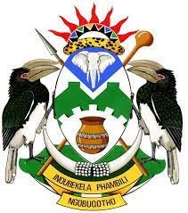
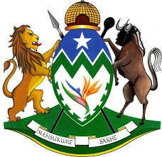
Even the redesigned arms for the inland provinces and towns look like they took some thought, and some pride. The arms of the Zululand District Municipality, where the seat of the Zulu monarchy resides, is imminently respectable, as is the coat of arms of the province itself.
But in the Cape, we must comfort ourselves that the provincial government itself has at least retained some respectable symbolic representation, even if the rest has been covered in wastepaper.